Showing posts with label Theory as Practice. Show all posts

Monday, 10 October 2016

Seminar - Introduction

We were introduced to the new seminars with Polina by discussing the plan for this year in theory, and what everything will be worth. 

Here is some key information:
Theory blog (50%)
Essay/visual appendix (2500 words)(50%) This will be expected in November.
There will be a summative assessment in April which will be in the form of a 10 minute presentation. 

Polina asked us what we thought theory as practice was. My answer was "looking at different art in order to develop a deeper understanding of multi disciplinary work in the industry." This year of theory is about finding myself as an artist. I am not sure who i am, or what i want to do and why yet. This is something i hope to know throughout this year. 

Research

What do I want to research/investigate? The things that we should be asking our selves are as follows:

Why: Context/background and literature review - why do you want to investigate that topic?

How: This is looking at the approach/methodology. It is important to ask yourself how will you proceed with a critical investigation when looking into the subject.

What: This is the outcome/ results and conclusions. This is the point where I should ask myself what i have achieved, and if there is anything in relation to future plans.

Research leads to originality, therefore when carrying out research this year we should be trying to improve our skills. Last year was at foundation level. This was to get us used to research on a basic level. However this year, as a second year student, i am expected to improve as this is classed as the transformation stage. Year three is where professionalism should be achieved. This fits as i want to partake in a placement. For the final year of my studies we are expected to be at the point of independence and originality.

"I had a story to tell. There is a gap between what is possible and where vision is, and i've had to fill that gap. You don't invent technology to figure out what to do with it. You come up with an artistic problem, and then you invent the technology in order to accomplish it. So it's the opposite of what most people think it is, and any artist will tell you that. And art, at all levels, is just technology." - George Lucas 

From sticking to asking these questions as a designer when trying to understand a brief, it should help to develop some starting ideas that can be developed further after some intensive research. Research is an important tool. The more a designer understands what is required out of the brief, the better the outcome will be fore both the designer as well as the client.

Task


We were handed a sheet in the seminar with a case study on. I chose the case study "Whitney museum of american art."

What?
The museums graphic identity allowing the communication to the audience providing the important point of continuity for members, visitors, and the public during the transition of a new space. It should appeal to the present audience as well as a new one.

Why?
Embrace  the spirit of the museum whilst serving as a visual ambassador for the new building, presenting old to new.

How?
Talking to staff who have been there for years. This would allow the designer to get an inside opinion on what the new brand should be like. This could be done through distinctive and inventive graphic systems that literally respond to the art. The brand need to be something that represents the museums ever changing nature.

This task allowed me to put what we had learnt into practice.


Friday, 6 May 2016

Gentle Ease

This lecture was with Sara. which focused on after effects. I have become more and more interested in after effects throughout the year as i have become more informed on how to use the program and have started to create more aesthetically pleasing results. The lecture had a lot of visual aids that allowed us to see what sort of things could be created on the adobe program.


Just one day was a piece that was shown in the lecture that showed a mixture of stop motion graphics created by hand, that had been added to adobe after effects in order to animate and scale. I think that the finish of this piece is spectacular, and the mixture between the hand made element and software works really well. I have created a stop motion piece in the past for my visualisation of sound piece. This was done through blowing ink around a page and then taking pictures that were used in after effects. This gave a better texture and realness to the work, and i believe that the same applies here.

We also looked at another animation that was created by hand and then later added to after effects, however this is a lot more sophisticated. The animation is by Drew Tyndell who works for cartoon network. The video was created frame by frame which allowed more movement. This is called 'romoscoping' and as you could imagine takes a very long time.


I enjoyed this seminar, as i am becoming more and more interested in after effects and animation as i learn more about it and some of the outputs that are possible. I am not very strong at drawing, therefore may struggle creating something that is drawing based, however it interests me greatly as a concept.

Thursday, 5 May 2016

Reflective writing

We talked about reflective writing. As a creative, we must know when our writing goes of course, and turns into ramble instead of rambling on and getting a higher word count filled with nonsense.

We were told in the seminar that there is not a wrong way of writing, as long as the subject matter stays at the forefront of the writing. The topic need to be addressed thoroughly and you must not go off on a tangent, and start talking about other topics where this is not needed.

It was a very good explanation of what is expected, and i am going to try and improve on my reflective writing as i continue as a creative.

How to have an idea

Today we focused on how to have an idea, and the process that we as creatives should undertake in order to develop a well thought out and contextually viable idea.

We first looked at aims, and how to communicate ideas through images, words, layout and sequence. It is preferred to build up a folder over time of references on a defined theme. This not only shows evidence of contextual and theoretical awareness, but also helps you to identify which way to approach the subject matter, and create a strong visual.

After this, I should evaluate weather the idea can grow in interest, or will it become boring and therefore not as fun to work on. I should also ask myself if it is just all facts, or is it just all process and technique. Sometimes the idea may be too simple and not have enough depth however other times it may not be achievable at all.

Sometimes creative blocks happen, and ideas can be hard to come by. If this situation arises, it is important to have a method of coming up with ideas in order to get out of this trough. It is good to mind map and get multiple ideas down. However, verification from peers is also a huge help. Acceptance of ideas, or even tolerances from society help for creatives to believe in their idea, and discussions can help in brainstorming more.

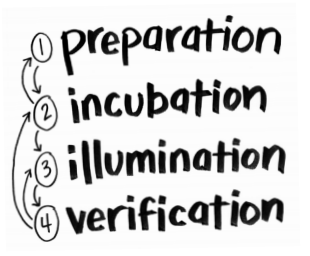
Graham Wallas (1858–1932), a British political scientist and sociologist came up with a theory for creative process. The Four-Stage Process Model Wallas believed the creative process could be described as a series of four stages:


Preparation: The problem to be solved is carefully considered and resources are gathered in order to confront the task. The conscious mind is focused on the problem.

Incubation: Drawing upon these resources, consideration of the problem is internalized and becomes a largely subconscious activity. The mind makes connections more freely and abundantly.

Illumination: Possible solutions to the problem transition from subconscious to conscious thought. This is a moment of insight and optimism.

Verification: Solutions are tested and may be applied if shown to be viable.


The process model is divided into four stages: Discover, Define, Develop and Deliver. For all creatives when coming up with an idea, we think of a lot of different ideas. This is "divergent thinking". Then we can refine and narrow down the idea in order to get to something to focus on. This is "convergent thinking" which can be represented by a diamond shape. However, the diagram is a double diamond for a reason. This process will be carried out twice. Once to confirm the problem definition and once to create the solution. One of the greatest mistakes is to omit the left-hand diamond and end up solving the wrong problem.

 If creatives use this method for idea generation, ideas will be developed, tested and refined a number of times, with weak ideas dropped in the process. This cycle is an essential part of good design.

I think that if i carry out this method when going through idea generation for my project, i will be a lot more productive in getting rid of the weaker ideas, and refining those that have potential. 


Design thinking

We looked at the double diamond in the first few weeks, however only looked at the first two quarters. The first quarter would help idea generation with an initial idea or inspiration, often sourced from a discovery phase in which user needs are identified, and the second quarter represents the definition stage, in which interpretation and alignment of these needs to business objectives is achieved.


The third quarter (develop) marks a period of development where design-led solutions are developed, iterated, and tested within the company and the final quarter (deliver) of the Double Diamond model represents the delivery stage, where the resulting product or service is finalised and launched in the relevant market.

This is just one of many design process models. 

In this lecture, we focused on a more detailed approach. This is called: 

7 stages of design process:

Stage 1: Define.

This involves asking all of the questions:

The 5 W's - who, what, where, when, why, (how).

- Who is the target audience/ client?
- What is the design solution the client is thinking of?
- When will the design be needed, and for how long?
- Where will the design be used?
- Why does the client think a design solution is required?

The questions above make you think, and it is understandable how ideas can be generated from just asking these five simple questions. If you know who you are designing for, and what the client wants designing. When it is needed therefore you have a time frame to complete the task in. Where it will be used, which will allow you to create a design solution that will fit to the environment it will be in. And finally, why the client requires the design solution. This may be because the design they have at present is not good enough and they need a rebrand for example. 

Stage 2: Research.

It is important to obtain both secondary and primary research as this will allow you to understand what you are designing more thoroughly. It can also spark imagination and help to generate ideas. Qualitative and quantitative research should also be carried out, therefore allowing you to have all of the facts and statistics needed. By the end of this you should have an informed concept and resources to draw from. 

Stage 3: Ideate.

"Creativity conveys a sense of pure inventiveness and lack of boundaries, yet design requires applied creativity towards a specific end." -Gavin Ambrose

Utilise different methods of Design Thinking which include; 
KISS - Keep It Simple Stupid
Focus Top Down and Bottom Up
Ockhams razor 
Python philosophy 
White space 
Text minimisation 
Graphic Impact User 
Centred design 

At the end of this stage, you should have a script and a rough visual language. This may include thumbnails, scamps or roughs. 

Stage 4: Prototype.

This is to test the feasibility of each idea, working in accordance with the guidelines  and from the brief.  If creating a video, you would create a few frames so you can see how it would look, instead of just having a sketched storyboard. This will allow you to see what works and what doesn't when looking at factors such as layout for example. 

At the end of this stage, style frames should have been created as well as a comprehensive layout that can then be brought forward into the final design. 

Stage 5: Select. 

This is the stage where you select what to take forward, and will help you to achieve a final composition that does not have aspects that do not work. 

Stage 6: Implement.

This is implementing all of the things that have been planned out in previous stages and actually building your output and defining the details, refining what has been trailed and clarified. In this stage, your work should be completed. 

Stage 7: Learn. 

This is the point where feedback is given on your outcome. This allows other people to view your work and voice some changes that could be made that would improve the piece. They could also comment on the things that (in their opinion) don't really work with the piece. 

It is important to get feedback as this how you can grow as a creative if the opinions of others are taken on board.  


G# Minor

In this lecture, sara talked about the power of the chord G# and how it is used in songs in order to make the sing sound similar to others. A lot of artists use the chord in this way. However they can change it ever so slightly in order to trick the listeners into thinking that it is something new. Some of the examples that we were shown in the lecture are as follows.

Dire Straits - Brother in Arms


Lady Gaga - Poker Face


Both of these songs use the chord G# Minor however sound completely different. It is clever how artists do this and does in fact show how powerful the chord is. I am interested in music myself, and actually contemplated taking music forward to college, however i now just play drums and dabble in compositions as a hobby.

Monday, 2 May 2016

Images as argument

What is an argument? 

I found out from this lecture that there are 3 types of argument. These include:

- Rational
- Emotional
- Rhetorical 

A rational argument is taken by philosophers who try to argue with reason and evidence in order to come up with a solution. These types of arguments usually have a distinct logical form. A rhetorical arguments are used by sophists (360BC) which use persuasion. 
We next talked about how images can be used as arguments, and looked at the Gestalt Shift with an image of a rabbit/duck.

This image is classed as an illusion as different people see a different image when they look at it the first time. Some see a duck as i did, where as some people see a rabbit which took me longer to spot. It is all down to the persons perspective. It is impossible to see both animals simultaneously however. 

We also looked at a piece that Robert Lazzarini created in 200, where he printed a distorted skull from real bone, as shown on the left. 

This followed by talking about distortion, as you could only see that the piece was in fact a skull if it was looked at from the correct angle.  

It was interesting to look at the different types of arguments, and i would have never thought of a picture being an argument. It is interesting how powerful an image can be.  


Monday, 4 April 2016

Helvetica

We watched the documentary film "Helvetica" which is a font that used to be called 'Neue Haas Grotesk'.The film by Gary Hustwist who also directed the film Urbanised that we watched early on in the year, looked at the difference between the style of the type back in the 1957 as well as went through the history of the typeface and how it came about.

The clean and modern typeface is used by many companies, and was one of the first fonts to change the old overwhelming advertisements in america to the clean, crisp ones we know of today. I enjoyed seeing how just a font could have made such a difference to a whole style of advertising. It was also interesting to see the opinions of the people who dislike the font, as these opinions are very rarely voiced about the much loved typeface.

I was not a huge fan of the film. I have only recently become more interested in typography since being at university, as i have realised how important it is in order to create a good finish for a piece. However the film was very long considering it was only about one typeface, and i think that it was dragged out a little bit longer than it needed to be.

Thursday, 10 March 2016

Reviewing the Essay

In this seminar we had a look at our essays, looking at what was good, bad and could be improved. We focused on the opening paragraph to the essay, but the things that were discussed could help to improve the whole thing. 

We firstly looked at how it began. We were told not to start he essay with "In this essay i will talk about" as this is not a very interesting way to open an essay, where an abstract would be much better suited, and be more interesting for the reader. 

We also looked at the length of the sentences. For the opening of the essay the sentences should not be too long, as you do not want to give away too much information on the topics that are going to be covered later on in the piece of writing. Short and medium sentences are good, as this will give enough information needed in the abstract, however still leaving unanswered question that may help to lead the reader to read on. 

I think that looking into brand/anti-brand for my essay was a good topic, as branding has become such a missive part of our society. We were told that we should always read the paragraph back and ask ourselves if it made sense, and informed the reader about everything that you wanted to put across. I think that i managed to explain branding and anti-branding thoroughly in my introduction.  

Monday, 18 January 2016

Prequel / Sequel

In this lecture we looked at prequel and sequel. This was looking at the fact that nothing is original, and the different designs that we see are usually inspired by other pieces of deign through history. People can still be creative and original work for themselves, it does not mean that people practically copy others work. however they guide their creative process in the direction that others have previously done, therefore being inspired by past pieces of work.

"Those who do not want to imitate anything, produce nothing." - Salvador Dali

This quote speaks volumes. And helped to lead on to looking at internet memes. These are a perfect example of a prequel / sequel as they are completely unoriginal. People still love internet memes because they are funny, but they have no value.

Finally, to conclude the lecture, we watch a video called "Everything is a remix". This was very interesting and was defiantly my favourite part of the lecture as i am into music in general, and it was interesting to see the creativity of music explained in depth. The documentary looked at how artists have used different sample beats that have been used before in other songs to create their own. It also explained the laws and regulations about using the beats. From this i took that legal remixing is fine, however illegal copying is not.


Visualisation of sound

For the first theory lecture back in the second term, we looked at the visualisation of sound which is the second project. Each week we will have a piece of music to respond to, which can be approached in a variety of different ways. We were encouraged to go beyond the means of just digital work, as this project has a lot of scope for more traditional practices in both print and animation.

There are at least 3 possible outputs covering both static and motion based responses. These include; notation, interpretation and experimentation.

We were introduced to graphic notation. This could be an interesting way to visualise sound, as graphic notation refers to any kind of music notation that uses pictures, symbols or illustrations, instead of or in addition to regular notation. 

Jacob Thompson-Bell said that:musical scores can be just as satisfying to look at as they are to listen to. This got me thinking of the different things that could possibly be used for notation. Could anything be used from ordinary everyday things if their was just a key to it? This is an interesting thought. However complicated the notation my become, there must be many ways of notating music for someone to play.

Jacob Thompson-Bell said also stated that visual art can be a powerful improvisers seeking musical parallels to the shapes and imagery of different creative mediums. 


This is the oldest form of notation, which is in cuneiform writing inscribed on a clay tablet. This is a form of logographic writing which dates back as far as 2000BC. The song is known as Hurrian Hymn No. 6, which apparently dates back to 1400 B.C.E. The piece was discovered in syria in the 1950's and was interpreted by Dr. Richard Dumbrill. The piece was performed by the very talented musician Michael Levy on solo lyre.

We then looked at various other ways that sound could be represented in a visual and aesthetically pleasing way. We looked at various different visuals, some looking into more abstract design. However one that stood out for me was a piece by Ligeti, G (1958).


This specific piece stood out to me as looking at it logically, i can kind of make out what is going on. With the other visual music scores that where exhibited, i did not understand how they could possibly be read. I myself can read notation to some extent for treble clef and bass clef, as well as drum notation also, therefore i can appreciate musical scores.

We then looked at some animations. One that stood out for me was the lyric video. I think that this would be a fun thing to create, and would allow me to improve my skills on after effects. 

We discussed that 2 experiments should be carrier out each week in order to complete the requirement of 8 experiments by the end of the project. These should be as experimental as possible, and can be either/both digital/ non-digital. 

Overall, the lecture gave me some ideas to think about, and i look forward to the coming project. 


Wednesday, 16 December 2015

Guest Lecture: Only Studio

Daniel and Matthew came in from Only studio and exhibited their work in an online portfolio format. I noticed how simple their designs where, with the use of san serif fonts and basic colour schemes.

In the lecture, they showed us the branding that they had produced for the festival the "lost village". I absolutely loved this as i am interested in festivals anyway, and this festival had a twist. The way Matthew and Daniel branded this new up and coming festival was very clever, and they defiantly thought of how the brand would be used socially. They created a very simple logo for the festival that would be easy for the general public to recreate. This will do a world of good in advertising the brand.

I like the logo for "lost village" as it is very simple and easy to replicate. It takes both the L and the V and used the typeface to create a logo with the letterforms crossing.

Matthew and Daniel also talked about how the they spent a lot of time creating the storyline behind the festival, which was to add character to the event and create a better experience for festival goers. The concept behind the back story is to give the feeling of the "woods coming alive". By adding this to the festival it may appeal to more people, or could be classed as a niche brand, as it has a very indie feeling about it.

The design of the website works well with the rest of the brand, as it embraces the handmade typeface that gives the festival an edge, with the crisp clean simplistic design that makes the website easy to navigate, and has a very nice aesthetic about it. The website acts as a hub for the brand, bringing all of the different elements, such as merchandise, tickets, and the story behind the festival together in one place. I like how they have made each characters backstory so accessible, and people can learn about their story, and then might see them when they go to the event itself. The whole brand as a whole works very well, and I am impressed with what Only studios have produced.

Thursday, 10 December 2015

Style

We started the seminar looking at the question "What is style?" The group came up with the definition; style is a group of things that are similar by sharing a common theme.

We watched a video, Moving on, Cornal West question and answer, focusing more on the style of clothes. However he says that clothes are not just clothes in their style, however it reflects a way of life. The way people dress reflects them, and what life they live. He dresses in an old style, dressing like an old jazz musician.

Henry miller gives a grounded explanation of his own style; "I invent, distort , lie, inflate, exaggerate, confound and confuse as the mood seizes me. I obey only my own instincts and intuitions."

Truman Capote claimed in an interview that a style is the "mirror of an artist's sensibility - more so than the content of his work"

Style vs Content: Can their be a content without a style? Can one act outside style?

Breuer believed in the "purposeful construction of logical designed objects" He believed that he was making logical decisions when designing the chairs, however he was designing them out of style in the time period.

Styles create an argument. There are style, style and more styles, and people may agree with some and not with others. Styles can be a form of opinion. What people like, and dislike. This can create an argument between two peoples opinions i.e two styles for example.


Structuring style; a style is a class which is made up of a set of attributes.


Recap

In the seminar we had a recap of all of the things that we have gone through with James so far. This was very helpful as we went back over the key words and some of the areas that i had partially forgotten about. We went through these in a chronological order.

Firstly looking at ways to approach research. In this particular seminar we looked at the idea of 20 questions. This was so we are open to change with a call and response approach which would result in different aspects of research being looked into. This may help to develop a project further or help with experimentation.

We then recapped the convergence lecture. This was about different techniques and even practices, coming together in order to create something unique. This lecture was an exciting one, as it was more practical based. It included putting together different newspaper cuttings in order to produce a piece. However the main thing that i found exciting about convergence is the multi practice, with different create arts coming together in order to produce something unique.

Abstract and Intros was the next thing we recapped. This was about opening an essay in a concise and interesting manner. The main aspects of a good abstract is opening strong. These first lines are the ones that you want to draw in the reader with. An abstract should be concise and exact, with the use of clipped writing to do this. You should always remember your pace and ask the questions your reader needs.

Finally, we recapped the most recent seminar session. This was all about style. This asked the question; is there content without style? My answer to this is no. Style is a part of everything, it can be an opinion, a way of dressing, and a way of life. Even when someone says that it is styleless, that is a style within itself. Styles are made up of different attributes. It can be seen as an imaginary box and different attributes are added to that box in order to create a certain style.

We did not look at future genealogy again as this was covered in great detail at the start of the seminar sessions. Overall, the seminar was very useful and i believe that i understand the things we looked at a lot better than i did before the session.

Summary Seminar

We looked over the topics that we have already covered as a quick recap before finishing the first term. This helped me jog my memory of the things that we have looked at.

Style is one of the topics that really interested me when we looked at it the first time, and re visiting the subject made me think about the concept again and how style is such a huge thing in our lives, and people do not really notice it as much as we could do. The fact that everything could be classed as a style is interesting, and even styleless-ness could be classed as a style in its own right.

Wednesday, 9 December 2015

Narrative Design

In this lecture with Stephen, he explained how important it is to fit a narrative to design, as this is a way in which helps you as a designer to communicate an idea to the audience in a visual way successfully.

We were shown a diagram that is used to explain the different stages of a narrative. This was created by a man called Arther Quiller-Couch.

The diagram starts with Exposition and then moves onto rising action. There is then the climax which is the main part of the narrative that people remember. After this, there is falling action and then denouement.

I took AS Media at college and i remember looking at a diagram that resembled the one exhibited. I never really thought about applying this knowledge into design.

We briefly looked at a video on TOMS shoes. The video explained the story behind the shoes, and i was surprised by what i saw. The reason for toms being created was to help the children in Argentina who didn't have shoes. For every pair sold, one pair was given away to those in need.  Even the name "TOMS" is derived from "Tomorrow shoes" as this is what they were named, because they would be the shoes for the children in the future.

I think that this video is a brilliant example of how a narrative can help when designing, as it can tie a person into the product or service emotionally. The video exhibited below has been beautifully made and follows the narrative structure. I am defiantly going to look more into narrative when designing, as i think that this is something that could really help me to improve my design outputs and help me to reach a new level of quality that i have not managed to reach thus far in my design career.


Monday, 7 December 2015

Unlocking Innovation

The seminar started off looking at Albert Einstein as he is known to be an amazing thinker.  He once said that it is important how the question is framed. 5 + 5 = 10 however if you ask the question 'What two numbers add up to 10?" then this created a wider range of answers.

The task for the seminar was to create something that could be flipped in a visual way. We were asked to make a transformation from one word to the other in 9 stages. This could include using pattern, colour, type or imagery to merge the stages into a visual narrative.


This was the example used to show the stages from one animal to another. It was created by an artist called Ecsher. 

Wednesday, 2 December 2015

Guest Lecture: Territory Studio


Territory studios came to talk to us in a guest lecture, and I can honestly say that the work that was shown was absolutely incredible. The studio works on massive motion pictures with marvel for example. They created the graphic computer interfaces for The avengers Age of Ultron. Some of the UI's that they created for this film are absolute masterpieces, as can be seen below.


AVENGERS: AGE OF ULTRON [UI Reel] from Ernex on Vimeo.

They explained how illustrator, cinema 4D and after effects all work together in order to create this graphic and i was blown away by the amount of detail put into the designs. It is only a small studio, and one person would create an entire UI in one day. Starting on illustrator and cinema 4D in the morning to set up a framework, and moving to after effects for it to be animated later.

After looking at some of the things that Territory studios have produced, I think that i will take more of an interest in Cinema 4d, as i believe that this is a very powerful tool to learn hoe to use.

Tuesday, 1 December 2015

Abstract writing task

In order to create a new brand identity for Blackburn, which can be easily recognised, a number of elements need to be addressed which will come together to create the new image of the town. These will include; the colour scheme, typography and the logos for the different areas of focus; education, entertainment, council based documentation and advertising and religion. The different outputs will be exhibited, focusing on the different ways the new brand will be incorporated into the town.

I intend to create a booklet that maps out the brand guidelines, looking at what the brand should look like, how it should be used and where it should be used. This will include mock ups, showing the re-branding in the actual streets of blackburn. The desired outcome of the re-brand is to create a contemporary brand identity for the town, which can be easily recognised and will reflect the movement towards the future of Blackburn opposed to living in the past. 

Monday, 30 November 2015

Perception or illusion?

Putting design into a social concept. Understanding how we work as human beings. Convey meaning through visual communication.

We achieve meaningful communication through developing a deep self awareness and more importantly the how audience perceive things. Designing for a useful purpose that will work in the real world. Taking into account the things that you can't see. Looking at different perspectives of design and investigate things that aren’t as obvious.

The image that we see when it hits the eye is upside down, however our brain flips the image. This is a good example of perception, as the things we see are filtered into different parts of our memory. 
A touch can change perception, and the mood of someone. An example of this was on the video where a women went into a library. The women on the desk touched her arm and did not smile, however when the customer was asked, she said that she thought that the cashier women smiled however did not touch her. 

We skipped further into the video and watched a basketball being thrown between some players, having to focus on the ones with the yellow jackets. As i was focusing on counting how many times they threw the ba
ll between each other, i didn't notice a man in a gorilla costume walk through the frame.


We then looked at optical illusions. This specific one is a test for people who are colour blind. I was able to see all of the numbers, 6,12,68, 8, 10 and 74. However some people were not able to see the numbers due to not being able to see primary colours properly. 


This plays a trick with the bling spot in your eye. We all have a blind spot where our retina connects. We drew this on a piece of paper and put the paper at arms length. As we moved the paper closer to our face, we couldn't tell how far away the paper was and hit ourselves in the nose. 

Due to the contrast on this image, it make it look like the image is moving even though there is no animation involved at all. This is down to the eye attempting to make sense of the image. If you focus on one black dot, the image should stop moving.